IB Visual Arts 2027 (First Exams) Curriculum
I had the opportunity to collaborate with the IB on the new Visual Arts curriculum (first assessment 2027). As part of this partnership, I developed official teaching and learning resources that are now available on the IB Exchange.
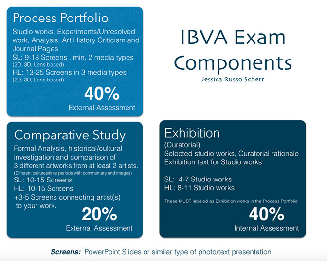
These resources include:
- Posters for each assessment component, breaking down the assessment criteria
- Conceptual posters supporting key ideas in the new curriculum (such as Situate)
- A walk-through video explaining each component and how they fit together
Teachers transitioning from the previous syllabus are encouraged to explore the IB Exchange for updated materials designed to support a clear, practical understanding of the IB Visual Arts 2027 curriculum.
For students beginning the new IB Visual Arts curriculum (2027), additional resources will be added here over time. As this is a new syllabus, content is being developed gradually.
Please bookmark this page and check back regularly for updates. You are also welcome to use the Contact form to let me know what types of resources or support would be most helpful for you right now.
Last Exams 2026
Process Portfolio PP
Exhibition EX
Comparative Study CS
Follow Jessica's board IB Art on Pinterest.
Follow Jessica's board Visual Art Journal on Pinterest.
Acknowledgment: This page is geared toward my IB Visual Arts Students and is based on the IB Visual Arts Handbook. This is not an official IBVA website.